Evidence-based decision-making is a prerequisite for sustained quality in public health systems. However, many governments globally rely on broad national data systems that don’t adequately capture the unique, real-time, and often-invisible issues on the ground.
In Kenya, for example, few formal channels exist to routinely capture client experience of care, beyond exit interviews that are costly and difficult to scale. The gap is not driven by a lack of political will. Governments are keen to get better visibility into the systems they finance, yet lack intuitive data tools to easily identify the ‘red flags’ in the areas they’re interested in.
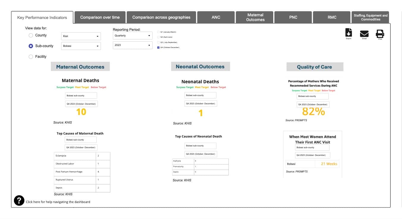
Since 2021, Jacaranda Health has been sharing real-time data with its local government partners across Kenya. The tools – which have evolved from written memos into sophisticated dashboards – aggregate information from mothers (via SMS-based digital health tool PROMPTS) alongside granular data on provider performance and facility quality.
However, despite anecdotal evidence of their use in decision-making, the Jacaranda team found themselves asking the same question: could these dashboards ultimately become a go-to resource for maternal health decision-making in Kenya’s public health system?
To answer this question, Jacaranda partnered with ideas42, a non-profit that applies insights from behavioral science, to better understand how key decision-makers perceive, prioritize, review, and act on data to inform and co-design dashboard adaptations. Between October and December 2023, 42 county and sub-county health officials shared their perspectives with us.
Our conversations took a step back from the dashboard, to explore the behavioral dimensions of how officials interact with data and how they perceive its value and use in their roles.
Insights emerging from those conversations gave us direction for how the dashboards could be strengthened and for what else might be needed to meet officials’ needs and priorities. We then returned to the officials with draft refinements to the dashboards and gathered their input and feedback on the details.
These discussions confirmed our assumption that the dashboards and data more generally were valuable to these stakeholders, but also identified concrete opportunities – both aesthetic and content-related – to better meet their needs, as outlined below:
1. Broaden the scope of data review to understand what’s driving poor outcomes
The interviews revealed a narrow focus on data amongst the stakeholders.
Busy county and sub-county officials predominantly focus on metrics that align with county and national priorities: “higher-level indicators” like maternal and neonatal mortality. Consequently, lower-level indicators that fall outside of this tunnel of immediate priorities are more likely to be overlooked, unless issues rise to the level of public outcry and demand attention.
‘Because resources are limited, you have to prioritize. So you don’t look at indicators that are not the highest priority at that moment, because they aren’t resulting in fatalities.’
This ‘streamlining’ of data review makes sense. Outcomes data is a solid benchmark for health system performance and remains a priority at the national level. However, it also impedes a broader focus on the ‘why’ of these outcomes, which could be explained by looking at other, typically less-prioritized or less familiar indicators, like respectful maternity care (RMC), prenatal care uptake, or stock out in facilities.
It was clear that these stakeholders needed a way of viewing priority metrics, while also tapping into data that could explain their underlying drivers.
Implications for design:
- ‘Front-end’ priority indicators (eg. outcomes data) amongst other information (eg. in an opening tab) to help decision makers focus on high level performance challenges first.
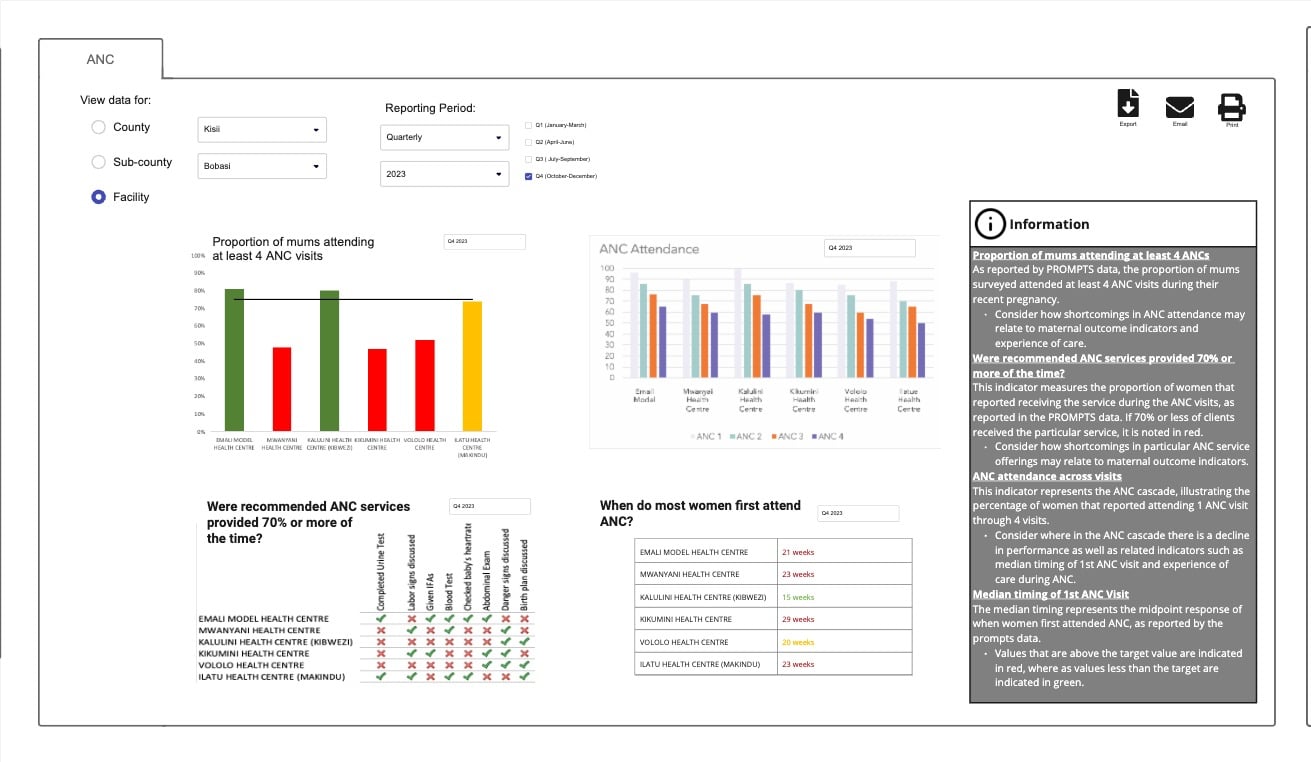
- Consider how ‘secondary’ data is grouped and sequenced to support the decision-making process and incentivize action. Priority indicators provide the ‘hook’, while secondary data contextualizes patterns and trends behind these indicators. Secondary indicators are often complex and manifold, and so demand logical organization (eg. consecutive tabs in a dashboard) to help users move through related data in a sequence that makes sense to their focus, for instance, the order in which a woman might receive services in the health system.
- Find innovative ways to bring client feedback to life. Incorporating mechanisms to collect and share back client feedback on a regular basis can help to increase its salience as a reliable indicator to decision-makers. While health officials are responsive to community feedback, challenges in gathering these insights can easily lead them to overweight the importance of memorable outliers.

2. Data needs to be presented in a way that is stakeholder specific
Government stakeholders have different data needs and priorities, depending on the level at which they operate.
For instance, sub-county officials are interested in understanding unique health facility performance challenges, whereas county health officials need to have visibility of broader trends across the county.
While KHIS (Kenya Health Information System) offers data at multiple health system levels, it can be difficult to navigate and lacks granular indicators that might support investigation or action in different jurisdictions. This hinders its perceived value: stakeholders will be less likely to spend time on a dashboard with indicators that aren’t relevant to them.
‘As a sub county management head, I don’t just want information from Levels 2’s, 3’s, and 4’s [facilities]. I want it from the community level, as that’s my field. It’d help me raise a red flag way earlier before it gets to any of my [facilities]’.
Personalized, easily-interpretable data is paramount for time-constrained health officials with multiple priorities.
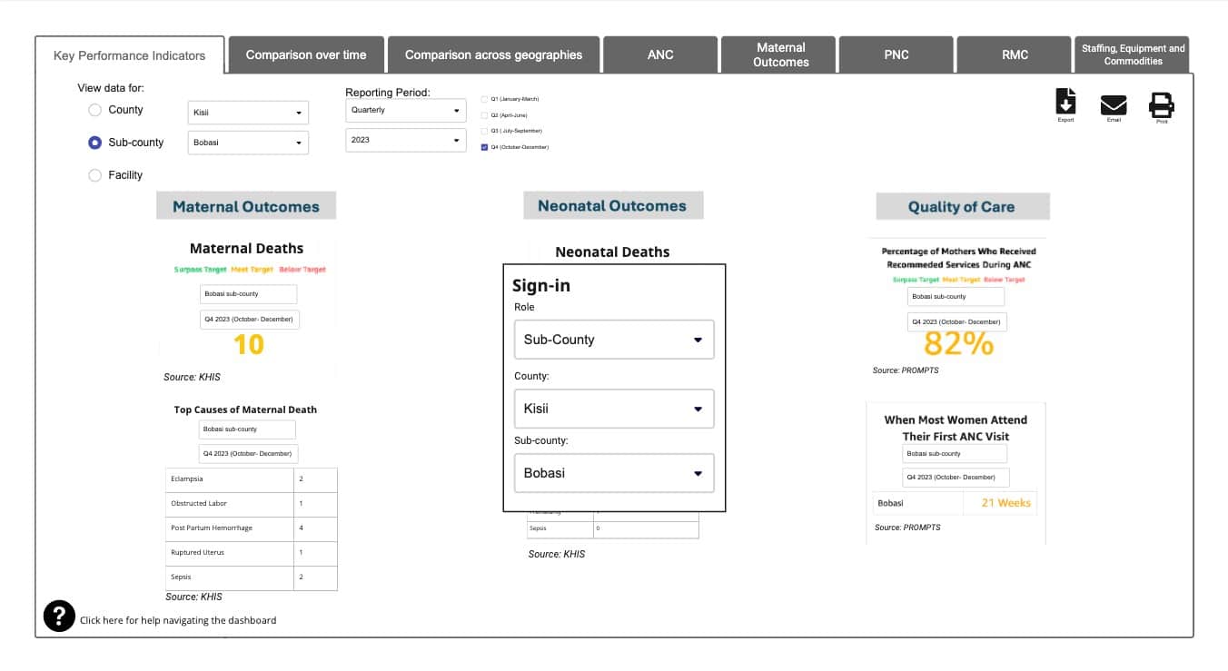
The discussions pointed towards a dashboard that could be easily filtered according to its viewer. Jacaranda actively collaborates with stakeholders at the facility, sub-county, and county level across its 22 partner counties, so it was essential to present data in a way that could be filtered to these criteria.
Implications for design:
- Personalize the experience by delivering customized information based on the profile of its user. For platforms supporting decision makers at multiple levels, different default presentation settings based on user needs can tailor the experience, and make the data more actionable.
- Enable meaningful review of qualitative feedback. As above, incorporating mechanisms to deliver client feedback systematically alongside other indicators can address the desire of facility managers for more context and help to reframe local performance issues.

3. Steer decision makers toward the actions they can take to improve performance
County officials have a mental model for “using data” that skews towards reviewing it more for quality than for taking action. They can be skeptical of outliers or unexpected results and a recurring trend was to question and investigate the completeness and accuracy of the data itself before focussing on what’s driving it.
Many health officials also have limited direct access to the data, or face challenges to interpret it, and are therefore dependent on the reports health records officers generate for their team’s review, which can be of limited direct use.
Officials often feel that understanding and acting on underlying challenges in facilities must be informed by a physical investigation, rather than the data itself, despite the cost and logistical restraints of conducting these visits at scale.
When there is a problem, you want to go there and know what happened and help them avoid the same [issue].’
The discussions reinforced the importance of the dashboards for rapid, cost-efficient identification of real-time facility issues, and as a means of better prioritizing in-person support (rather than replacing it entirely).
The design considerations below suggest ways of helping these stakeholders use data to pinpoint poor performing facilities as a starting point, before targeting supportive measures like mentorship, supervision and staff reassignment from there.
Implications for design:
- Make it easy to digest. Present information and data in a way that makes it easy for decision makers to digest and interpret without requiring additional support or guidance. For example, narrow the amount of data in an individual table or chart, ensure labels and units of measure are clear and intuitive, and limit unnecessary comparisons that do not shed light on what the decision maker should do.
- Incorporate cues and next steps. Steer decision makers toward the actions they can take to improve performance. For example, integrate visual cues such as color-codes and target lines to help contextualize the data being viewed with minimal guidance. Then link common challenges to recommended next steps.
- Highlight new and persistent challenges in data. Understanding fluctuations over time enables decision makers to understand whether an issue is new or a challenge over multiple reporting periods.This distinction can inform whether action is required.

In Summary…
Government stakeholders are willing and eager to use data for decision-making, but must be equipped with data tools that are easy to navigate, personalized to their needs, and support smarter interpretation of complex or siloed information. A better understanding of the behavioral dimensions of their choices and priorities offers clear direction for how those tools can meet their needs.
Working collaboratively with government officials in a co-design process is essential to developing and disseminating such tools in that it promotes early buy-in and adoption from the stakeholders they serve, and ultimately helps bridge a gap between basic data review and the actions that follow.
The willingness of government partners to engage in this process has been encouraging, and has led us to several important design recommendations which we will continue to test and reiterate with the collaboration of these partners.
We’re keen to hear from other innovators about their challenges, learnings, or experiences with data co-design. If you would like to get in touch with either Jacaranda or ideas42, please send an email to either @[email protected] or [email protected].
______
ideas42 is a nonprofit that applies insights from behavioral science—the study of how people make decisions and act in the real world—to improve lives and drive social change.


